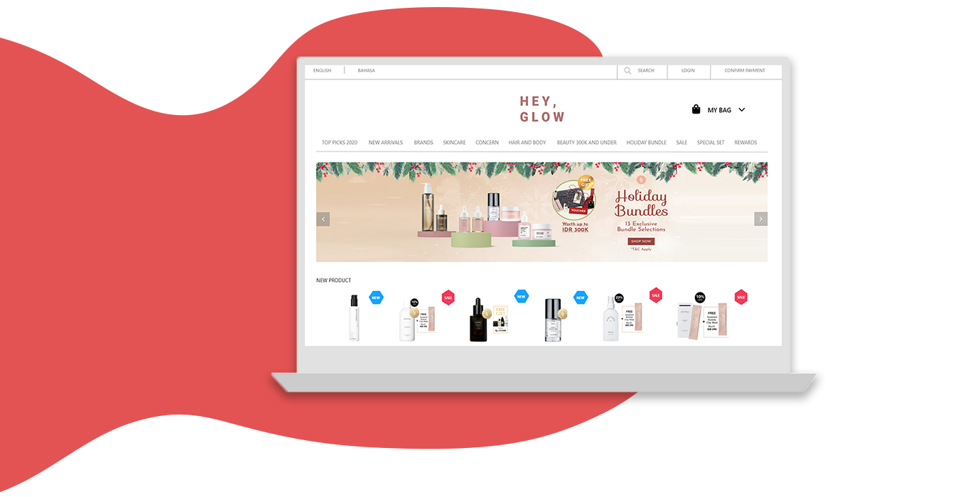
This project is to redesign a beauty online shop website, Hey,Glow.
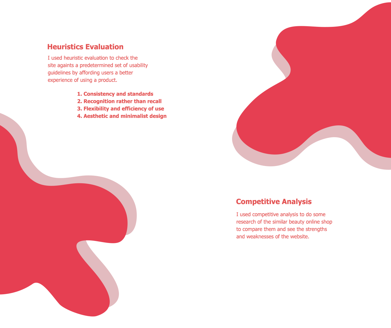
I used heuristics evaluation and competitive analysis as a research method. I checked out several problems and defined some primary needs. I created a Low-Fidelity design and High-Fidelity design. It took me 1 week to finish it into a final design.
Started by 3 girlfriends who are obsessed with having skin that glow for days. Partnered with the brand owners and distributors to carry out only the best cult brand and promoted more in Indonesia. By providing 100% original assurance, they are also a window of promotions between brands and consumer.
All the girls that want to taking good care of their skin and make they look and feel beauty.
After I figured out the problems, I defined some primary needs:
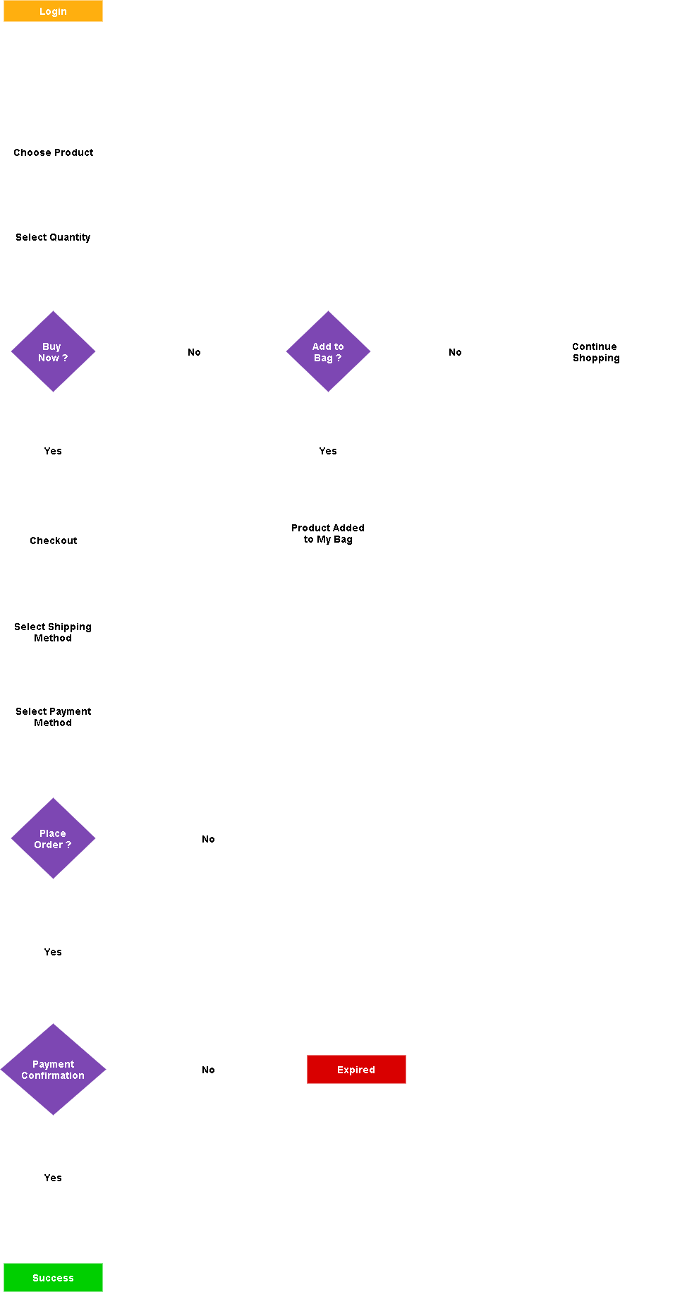
After analyzing several problems and define some user needs, I immediately put them into a Low-Fi design to make it easier for me to picture some design changes. This Low-Fi version helps me identify another problems that arise so that it would be easier and faster to be corrected again.
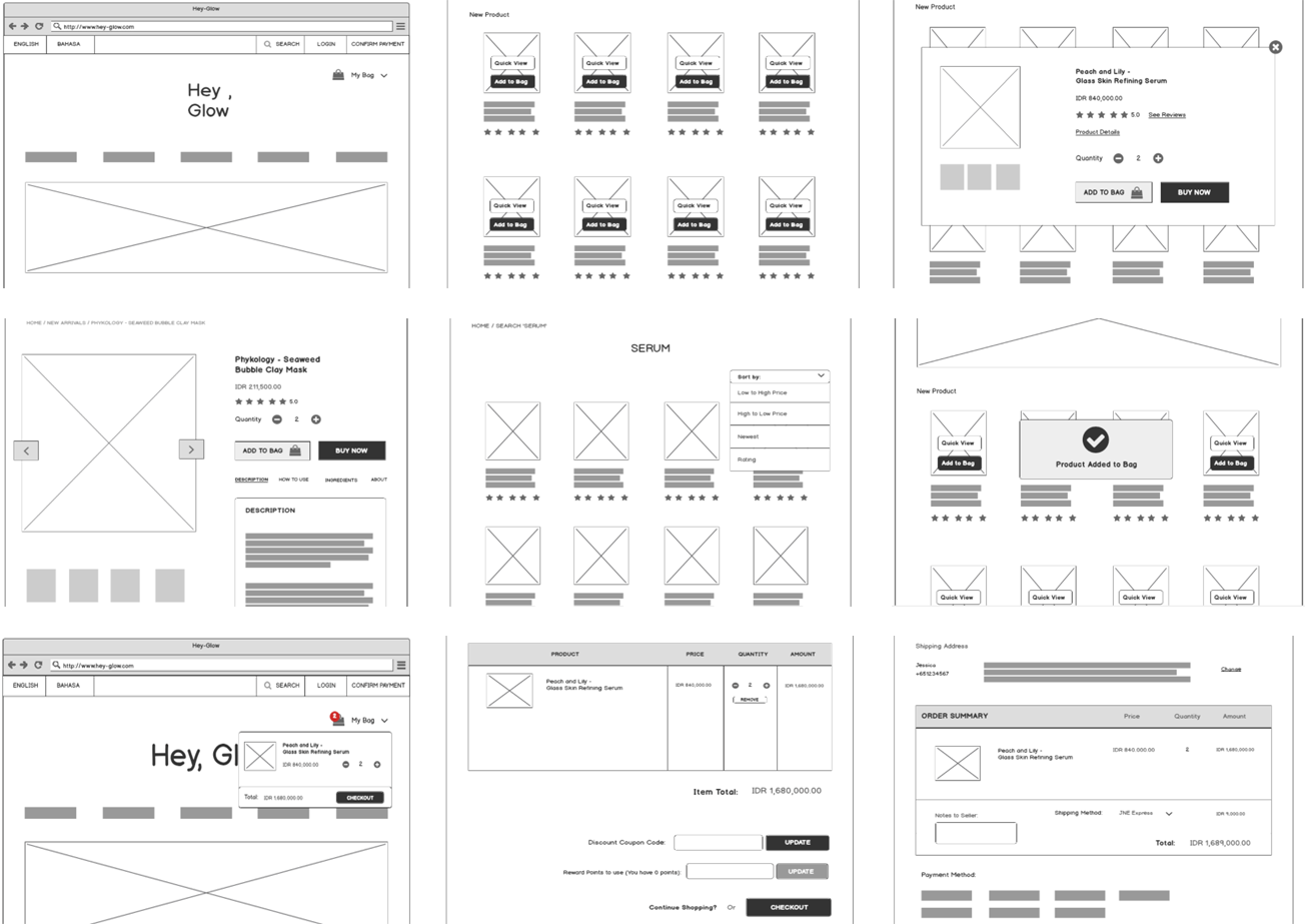
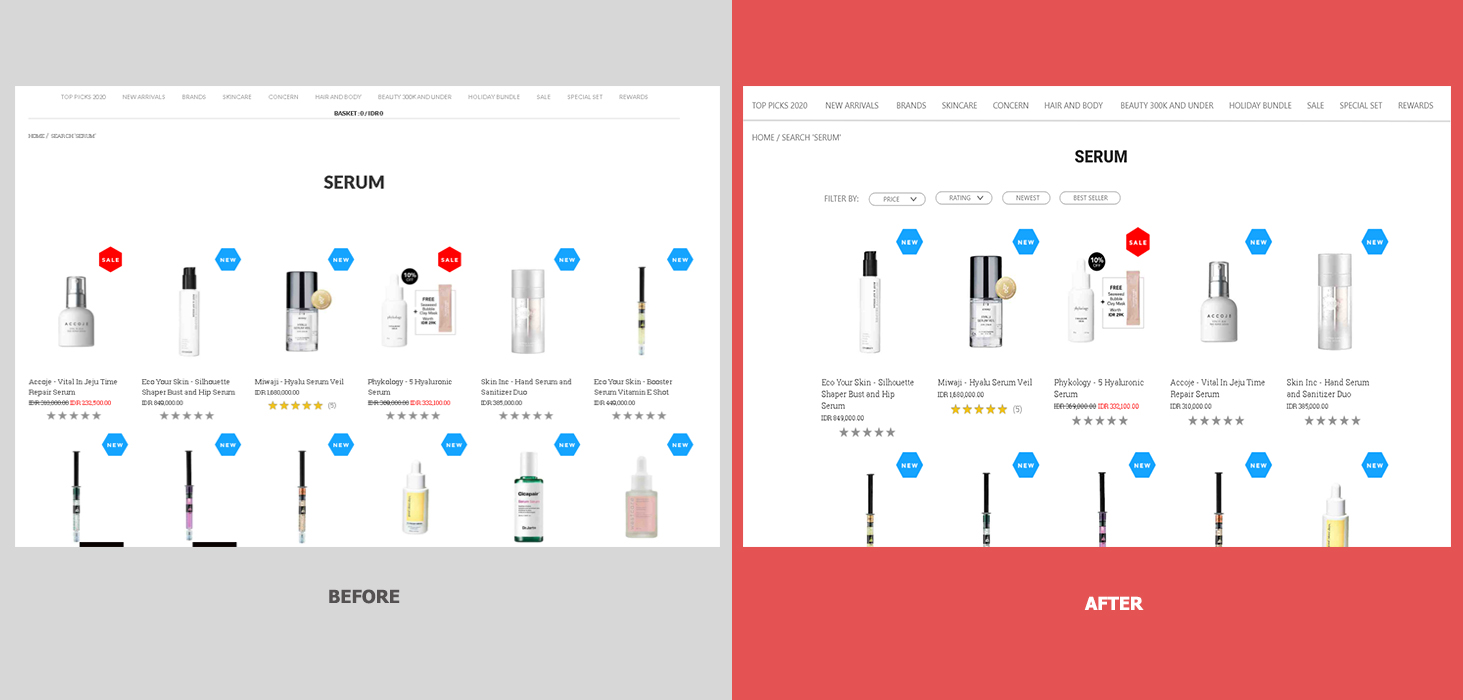
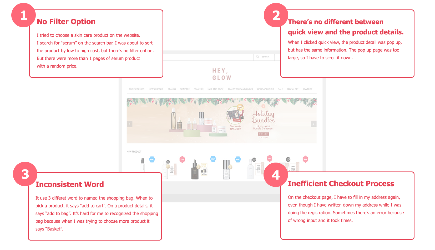
I added filter option after search a product. This feature can sort the products by price (from low to high or vice versa), by rating (from high to low or vice versa), based on the latest products and the most popular products. The product results can be more than 1 pages and it may be difficult for users or will take a long time to find the ideal product.
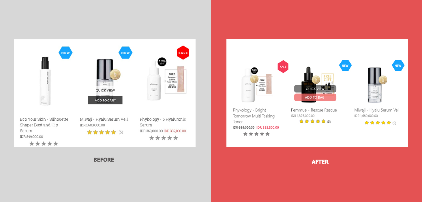
In this case, I use "bag" instead of cart/basket. I changed the words from "add to cart" to "add to bag". Then, I changed the color of the quick view button from white to black, because the white color blends with the background color, and I made the button shape longer than the product, so that the button looks clearer and to avoid the black color that looks faint if there is a black product behind it. I made the other button with a rose color. It means to focus attention quickly and get people to make a quick decisions.
.gif)
Instead of displaying a pop up menu that provides 2 actions, I choose to add an information pop up stating that the product has been added to the shopping bag.
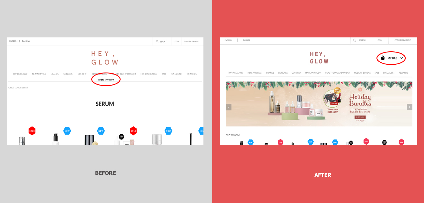
After put the product into a bag, I can't recognized the bag immediately. because it says "basket" and also uses black text that placed in the middle of the content. To make it easily recognize, I changed the word into "My Bag" and added an icon and placed it at the upper right.
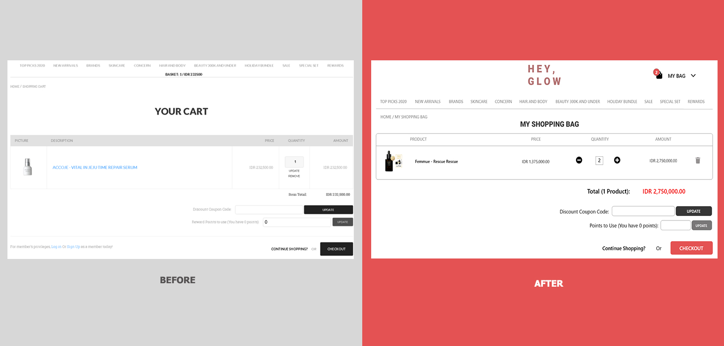
After add the products, there will be a red-numbered circle as a notification at the top of "my bag" icon. I also changed the word from "your cart" to "my shopping bag" to make it consistent to use "bag" instead. I changed a bit the looks of the table. In order to update the quantity, in the previous version, I have to change the number manually and then click the update button. So, I changed it with the "+" and "-" icons to minimize user's action. I also changed the remove button with a trash icon and placed it at the right of the table.
.gif)
To prevent users from remembering products that have been added to the shopping bag, I made the shopping bag menu floating when the cursor was hovering over the "my bag" icon. Therefore, users don't have to go back and forth to the basket. the information presented is made to a minimum and the user can easily update the quantity of the product.
The total price presented in a red color because it is a highly visible color that is able to focus attention. I changed the checkout button to rose color to get people to make a quick decisions.
.gif)
The quick view uses same information as the product details. This causes a long page information and user has to scroll it down, where a quick view should be displayed to a minimum and adjusted to the screen size.
.gif)
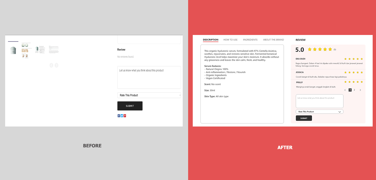
I minimized the information and I prefer to add product rating rather than the reviews to prevent large page. I create a red link to see all the product reviews. I also create a link to hide the product details such as descriptions, how to use, ingredients and about the brand. I provide 1 more button named "Buy Now" in case user wants to checkout the product immediately.
On product details, there are lots of empty space below the image. So I changed the position and colored the background to get attention from user.
.gif)
The checkout page at first was very long. It asked to fill in the address again, although I have written down the address on the registration process. It is possible to write the wrong address, even if it doesn't show errors. I have to go to the top of the page again to make sure I wrote the right address.
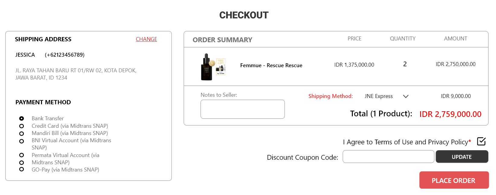
It would be more efficient to not fill in the address again. The default address will be displayed according to the registration process. If you want to change the address, I provide a red link button on the right. I moved the shipping method option into the order summary table as well as a notes to seller.